The challenge
Finding a place and deciding to visit it are different tasks. A person needs to understand what makes it interesting, where it is, and how it might fit alongside other plans. I designed Urban Manual around those decisions, starting with a collection selected for its character rather than exhaustive coverage.
My role
I founded Urban Manual in 2020 and began its software-design work around 2024. I lead product direction, place curation, and interface design. I use Figma, Claude Code, and Codex to explore ideas and turn them into working interfaces; my contribution is defining the experience and directing and reviewing the implementation.
1. Keep the map close to the decision
A pin tells you where a place is. The accompanying feed explains why you might care. I brought those views together so people can compare the character of a place with its geographic context.
On smaller screens, the map competes with the content for space. I kept a continuous browsing feed beneath the map and worked within the existing shared controls to keep the two views coherent.
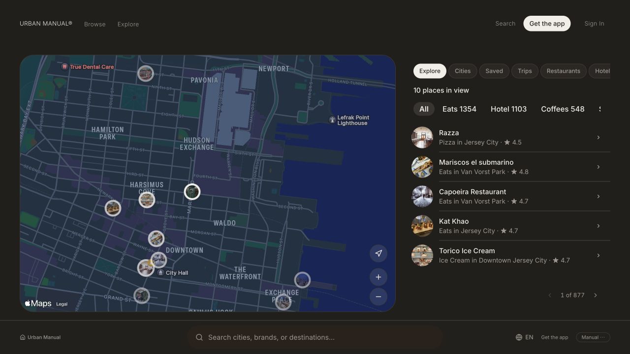
Desktop discovery, September 4, 2026.
2. Reveal detail as interest grows
The browsing view needs to be compact enough to scan. The detail view needs enough depth to support a choice. I organized photography, editorial context, and practical information across these two levels instead of asking one card to do everything.
The native design direction expands a place card into a fuller view. This preserves a recognizable starting point while giving the content more space. It is a design direction; the web capture below illustrates the content hierarchy rather than that native transition.
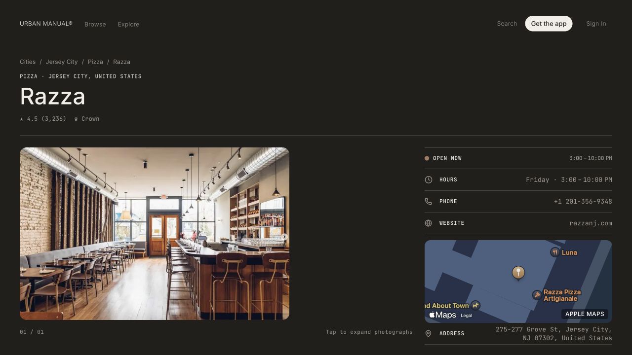
Web place detail, September 4, 2026.
3. Let people save before they schedule
I separated collecting an idea from assigning it a time. People can keep places in a trip while they are still exploring, then organize them into a timeline as the day takes shape.
That choice creates a second obligation: a place must remain recognizable when it moves between scheduled and unscheduled states. I specified return, cancellation, and editing behavior to preserve the context of the trip when someone changes their mind.
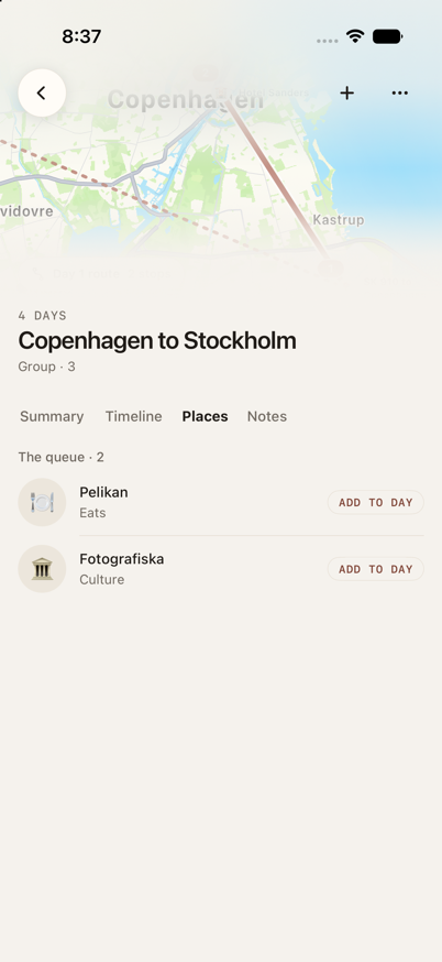
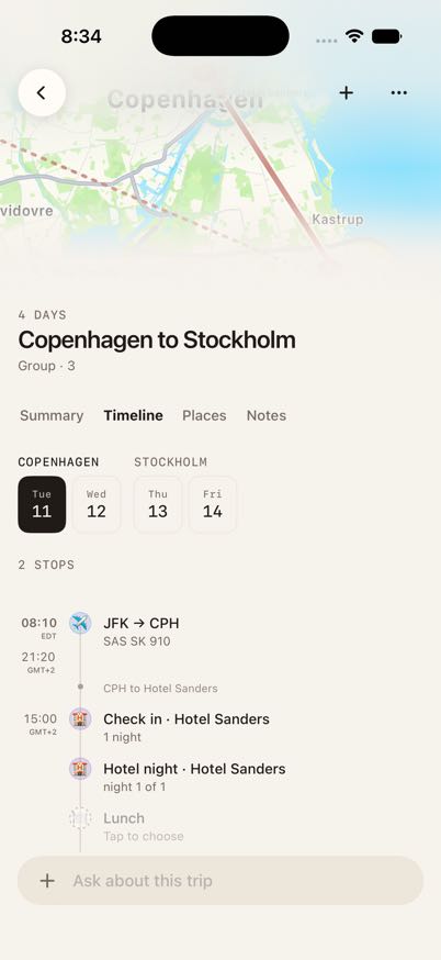
Simulator preview data, September 4, 2026.
Building with AI requires design judgment
I use AI coding tools to shorten the distance between an idea and an interface I can inspect. I supply the current components, design references, and intended behavior, then evaluate the result against the task the person is trying to complete.
One recurring correction has been overly simplified place rows. A cleaner-looking result can remove the very information that helps someone choose. My response is to identify what context was lost, clarify the hierarchy, and review the revised interface rather than accepting the generated layout as the final design.
Within the product, I set a separate boundary: people select the collection; AI helps users find relevant places within it. Recommendations and actions that change a trip need distinct behavior and appropriate user control.
What exists and what comes next
Urban Manual has a public iOS app and web product. This case study presents specific design decisions and dated interface captures. I have not yet established measured improvements in conversion, retention, or task completion.
My next evaluation would follow three tasks: find a suitable place, save it without scheduling it, and revise a planned visit. I would observe where people hesitate or lose context, then use those findings to prioritize the next iteration.
View the web product: https://www.urbanmanual.co View the iOS app: https://apps.apple.com/us/app/urban-manual/id6761741291